Toggle Accordion Attributes for Accessibility
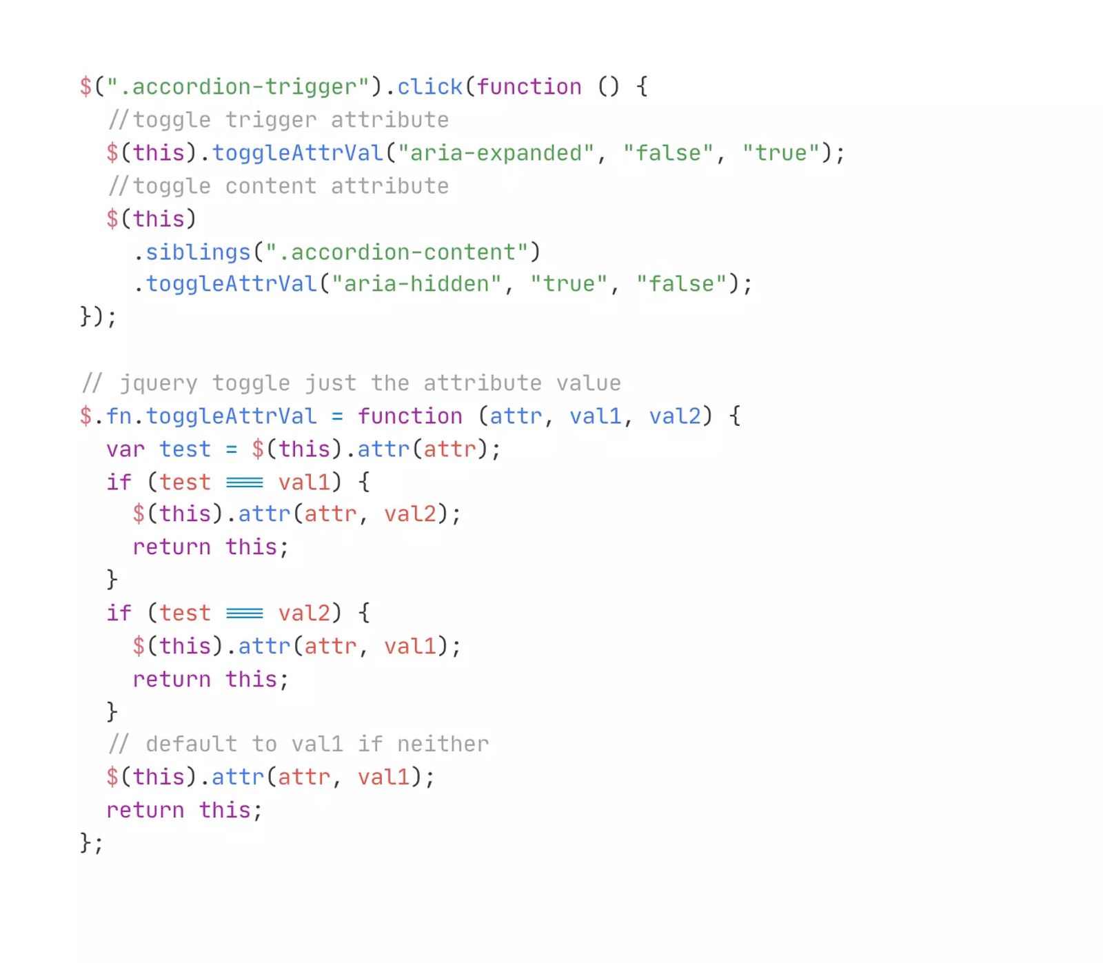
Enhance the accessibility of an accordion component by toggling an aria-expanded attribute when the accordion is opened or closed.
.accordion-trigger would be the button that triggers the accordion to open and close on click, and should start with an attribute of aria-expanded="false" that is set within the Webflow Designer. The direct sibling element to the trigger would have the class of .accordion-content and is what is changed with interactions to be hidden/shown and size is set to 0/auto.
For another great accessible accordion example see: https://webflow.com/accessibility/checklist/task/ensure-accordions-are-keyboard-navigable
Tags
Creator
Share this item
Have feedback or a question related to this item? Drop us some feedback!












Interfaces › Design Engineering Magazine

Subscribe for updates
Get updates on the latest curated resources and be the first to hear of new features.
SubscribeStyle, type, and motion in harmony, architectural web glory, AI your brand
When AI becomes your copilot, make sure you still know how to fly the plane.
Featured inspo