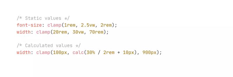
How to make text responsive with clamp
2.27.24
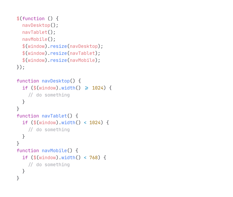
Hide/Show Based on Breakpoints and Count of Items
3.26.21
Quick answers
Responsive: the short version
What are the newest Responsive code resources on No-Code Supply Co.?
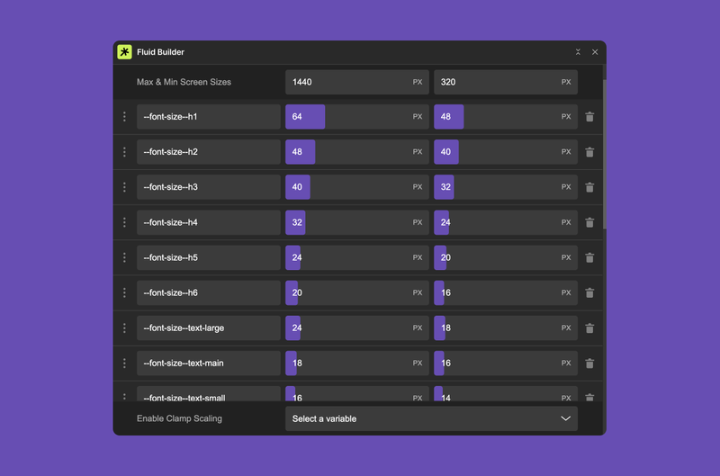
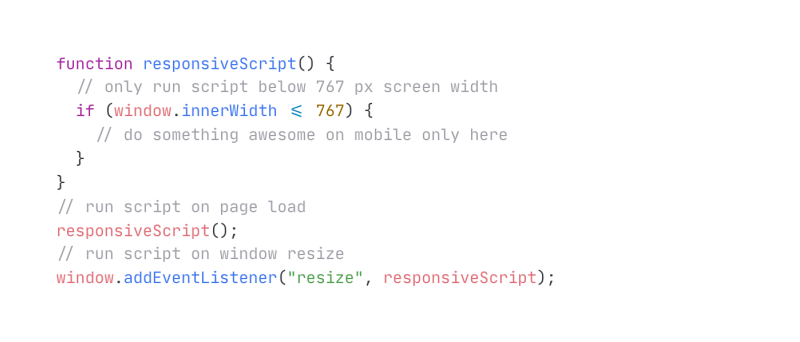
The latest additions are Fluid Builder Webflow App, How to make text responsive with clamp, Run Javascript on Mobile Only, Hide/Show Based on Breakpoints and Count of Items and Min/Max/Clamp Individual Styles.
How does No-Code Supply Co. choose Responsive code resources?
Every item is found and reviewed by a person; nothing is listed automatically, and sponsors can’t buy a spot or a score. As we review them, items get a Curator’s Take: a score from 1 to 3 (Worth a peek, Solid pick, Stopped us mid-scroll) and a one-line opinion.
Subscribe for updates
Get updates on the latest curated resources and be the first to hear of new features.
SubscribeStyle, type, and motion in harmony, architectural web glory, AI your brand
When AI becomes your copilot, make sure you still know how to fly the plane.
Featured inspo
Half the Sky
Rehtrew
Bleibtgleich

Refero Styles