Mast <> A CSS Framework for Webflow
Mast is a lightweight framework of essential classes, components, and strategies to help you build efficiently for any brand and scale in Webflow.
Read DocsClone stylesLess is more
Less classes, less elements, and less components equals faster site, development, and customization. Build from scratch in record time, and quickly customize the base styles to match your brand.
Light BASE CSS
84 kb
Build mode system
11 Universal components
Build mode components
Create vs copy
Leverage the power of Webflow to quickly build anything from scratch with an essential set of HTML/CSS building blocks, versus spending time finding and modifying pre-built templates and layouts.
DRY 12 column grid
67 classes
Strategic Utilities
50 classes
Helpers
Class notation
Tried & true
An opinionated framework of fundamental base, layout, and utility classes defined from 10+ years of front-end development best practices that are applicable to almost any use case.
Powerful Unit strategy
REM + EM + % + PX
Robust Nomenclature
Prefix, Infix, Suffix
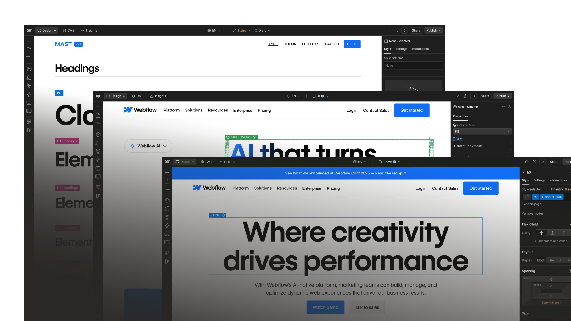
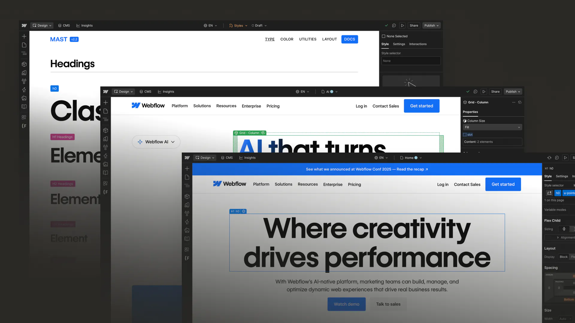
How Webflow uses Mast on webflow.com
Get a behind-the-scenes look at how Webflow rebuilt their new Enterprise-grade site with Mast to empower their entire team to build more efficiently and consistently at scale.
Loved by Pros
Don't take it from us — from one page to Enterprise sites, many of the top Webflow Pros love and iterate upon Mast with every project.

Maggy
MAST has been my favorite Webflow framework for the past couple of years. I love the simplicity, scalability, and adaptability.

Luke Netti
I've found developers have this type of efficiency down. Webflow is catching up, but wasn't traditionally built for that sort of thing.
MAST feels like a trend in that direction for me.

Devin Fountain
No joke, switching over to @CoreyGMoen 's MAST system has allowed me to build about 10 pages in a day, structure complete.
Saying I'm a fan is an understatement.

Ollie McMillan
Just finished converting the CSS framework for a client's #webflow site over to #MAST from @NoCodeSupplyCo and have reduced their CSS file size by 60%.
Not a bad way to start 2024! 😎

Dive - Grace Walker
In her Deep Dive, @graceongrid shares her secret for how her efficiency has skyrocketed in Webflow over the past year 🚀
How?
Because she started using CSS frameworks like Mast from @NoCodeSupplyCo

Greg Faulkner
It has made developing enjoyable again. Discovering fresh approaches and tinkering with my own improvements while building sites brings back my former love of development.

Sara Brunettini
Just started building my first site using MAST and I'm absolutely blown away! I'm amazed at the results I can achieve with just a minimal number of elements and classes. Huge thanks to the team at @NoCodeSupplyCo 👏

Ollie Allen Fox
MAST + Understanding Box Model & CSS has made me the most productive Webflow dev I’ve ever been.

Ben Hammond
Since using the MAST framework, my workflow has been so much faster 🚀

Matt Evans
Building with MAST by @NoCodeSupplyCo is such a joy
👋 Always there but never gets in the way
💡Opinionated but not dogmatic
🤝 The build partner you always wantedGive it a spin...

Grace Walker
I've launched 90+ client websites in the 6+ years I've been building in @webflow - MAST has been transformation in how I approach site builds 🙌

Coco Vega
I’ve been using it for a couple of weeks now, and it is incredible. I’m already moving a client’s project to Mast and starting new projects with it.


Watch the livestream
Check out these livestreams from Mast's creator — one covers the why, what and how (+ a Demo!) of Mast, and the other is a walkthrough of whats new in Mast 2.0.


Start building more efficiently for any brand and scale in Webflow
Ready to build your next Webflow project in a more efficient, consistent, and scalable way using Mast? Check out this overview view on how to get started.


.webp)


Get started
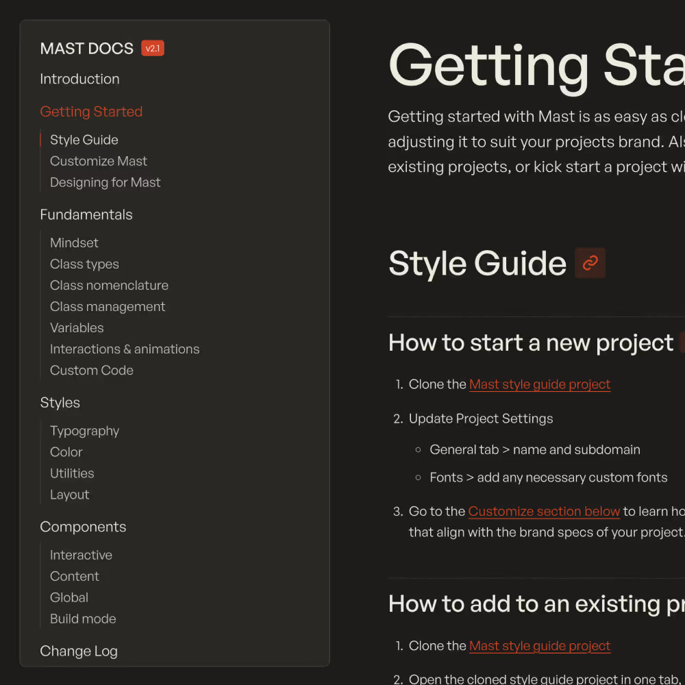
Read the docs
Learn more about the underlying strategy, best practices and documentation on how to get started with Mast and use it to its full potential.
Clone style guide
Start each project from this base project of classes that are the foundation of the Mast framework.
Share some feedback
Have a question or comment related to MAST? We are grateful for anyone that has the time to take it for a spin and welcome all feedback!
Send Feedback