The trick to viewport units on mobile | CSS-Tricks
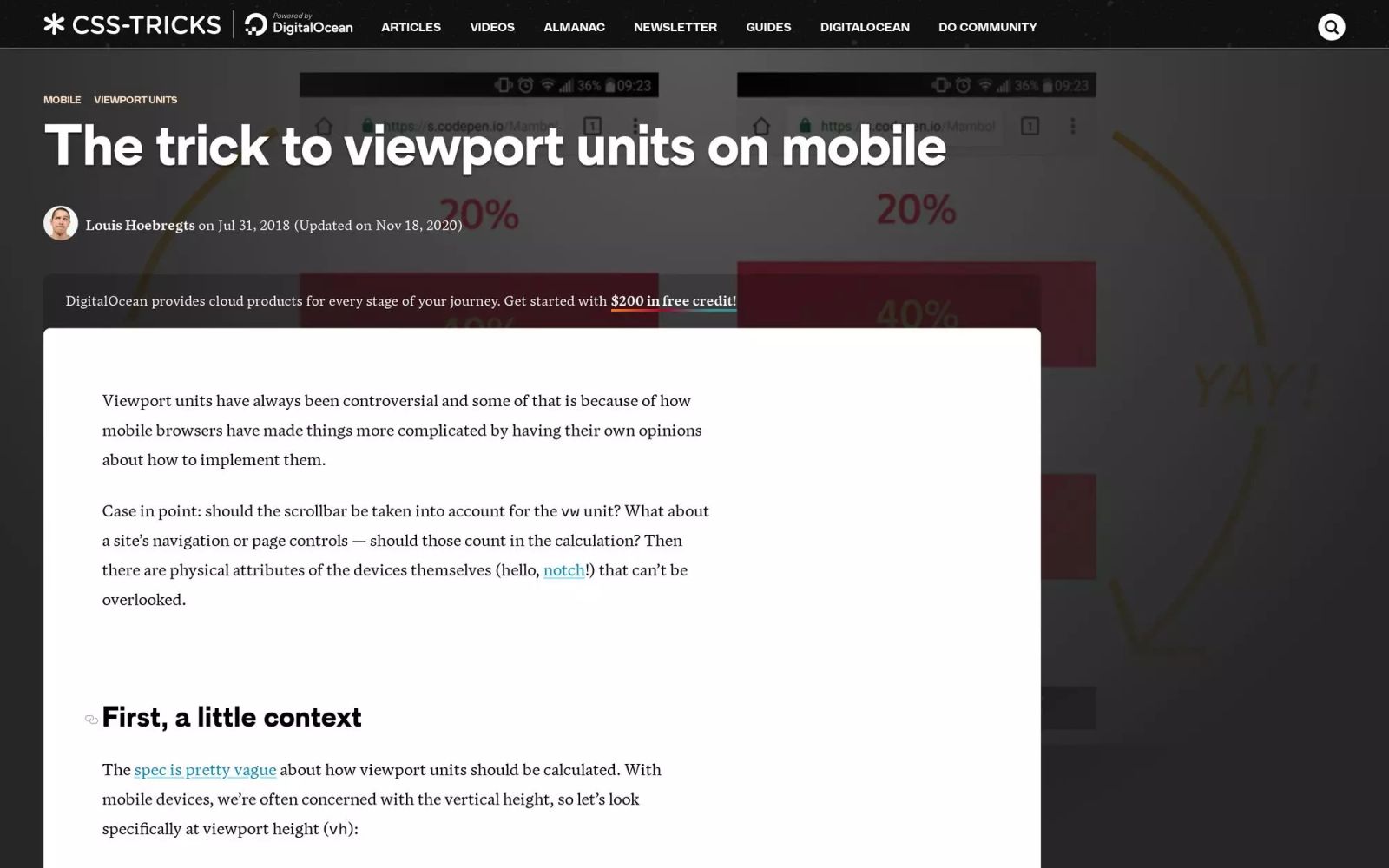
Viewport units have always been controversial and some of that is because of how mobile browsers have made things more complicated by having their own
Tags
Share this item
Have feedback or a question related to this item? Drop us some feedback!
Curated:
12.3.19


How to add dynamic filtering and sorting to your Webflow websites
12.3.19

Infinite scroll: how to keep your audience engaged in 2019
12.3.19
How to create a React app out of a Webflow project
12.3.19


How to build page transitions in Webflow
12.3.19


Moving Our Blog From Medium to Webflow (Subdomain to Subfolder)
12.3.19



Interfaces › Design Engineering Magazine
5.19.26
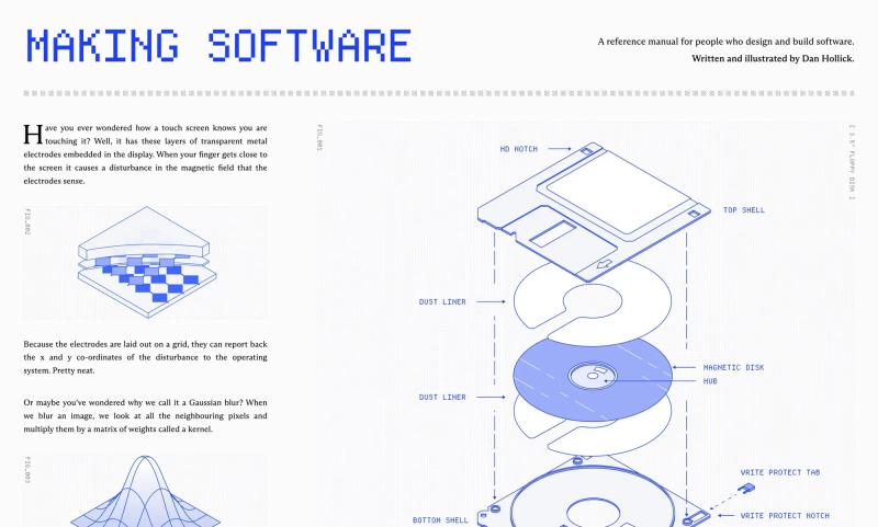

The logo soup problem (and how to solve it)
4.13.26




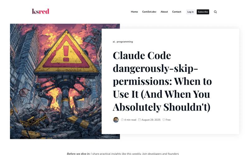
Claude Code dangerously-skip-permissions: Safe Usage Guide
1.5.26

Compound Engineering: How Every Codes With Agents
1.5.26


Subscribe for updates
Get updates on the latest curated resources and be the first to hear of new features.
SubscribeStyle, type, and motion in harmony, architectural web glory, AI your brand
When AI becomes your copilot, make sure you still know how to fly the plane.
Featured inspo

Half the Sky

Rehtrew

Bleibtgleich

Refero Styles